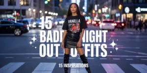

Fall family photos are basically Mom’s runway moment—she’s the one booking the photographer, scouting the location, and coordinating the outfits. Picture warm and earthy tones like rustic rust, enchanting olive green, and deep, cozy burgundy making your photos pop no matter what setting you choose. Most photographers will recommend planning your outfits around two focal colors and a few grounding neutrals, allowing for enough variety to keep things from feeling too matchy-matchy without being visually distracting. From coordinated neutrals to vibrant autumn palettes, these 20 outfit ideas will help your family look cohesive and camera-ready for beautiful fall photos.
1) Navy and Mustard Palette
[Image: Family coordinated in navy sweaters, tan pants, with mustard yellow accent pieces and neutral shoes]
Image Reference: Navy and mustard coordination available through retailers like Target, Old Navy, and Gap
Navy and dark greens provide a classic and timeless feel, fitting for any fall setting while mustard adds perfect seasonal pop.
Navy serves as a sophisticated grounding color while mustard yellow brings warm fall energy. Tan pants and neutral accessories complete the cohesive look.
This versatile combination works for outdoor nature settings or urban backdrops. The contrast photographs beautifully and feels distinctly autumnal.
2) Earth Tone Neutrals Ensemble
[Image: Family dressed in browns, tans, creams, and soft beiges creating warm neutral harmony]
Image Reference: Earth tone pieces available at retailers like H&M, Zara, and J.Crew
An earth tone color palette that leans neutral includes browns, greens, grays, and reds—perfect for nature shots complementing background colors seamlessly.
Rich earth tones like chocolate brown, burnt orange, rust, khaki, and butter yellow pop against autumn backgrounds while keeping focus on faces and expressions.
Layer different shades of neutrals to create depth without introducing competing colors. This approach creates timeless photos that never look dated.
3) Burgundy and Cream Coordination
[Image: Family coordinated with burgundy sweaters, cream-colored pants, and neutral accessories creating rich contrast]
Image Reference: Burgundy and cream pieces available at retailers like Target, Nordstrom, and Anthropologie
Good clothing options for fall family photos include burgundy, navy, browns, and ivory—colors that photograph exceptionally well in autumn light.
Burgundy provides rich fall color while cream offers soft contrast. This combination feels both cozy and elegant for seasonal photography.
Add texture through chunky knits, corduroy, or velvet to create visual interest without introducing new colors. The rich palette photographs beautifully.
4) Olive Green and Rust Palette
[Image: Family wearing olive green tops with rust-colored accents, denim bottoms, and coordinating accessories]
Image Reference: Olive and rust coordination available through contemporary retailers and outdoor brands
Enchanting olive green paired with rustic rust creates pure fall magic—these colors make photos pop in any outdoor autumn setting.
Olive green connects with natural backgrounds while rust adds warmth. Denim provides neutral grounding that everyone already owns.
This trendy 2025 palette feels fresh while remaining seasonally appropriate. The colors complement fall foliage without competing visually.
5) Plaid Coordinated Family Look
[Image: Family wearing complementary plaid patterns in burgundy, steel gray, and wheat undertones over dark jeans]
Image Reference: Plaid coordination available at retailers like Gap, Old Navy, and J.Crew
Both mother and toddler dressed in light plaid overshirts with burgundy, steel gray, and wheat undertones create coordinated but chill styling.
What works incredibly well is the palette depicting still, gentle light. Plaid adds pattern interest while maintaining color cohesion throughout the family.
Layer plaid over solid basics so patterns complement rather than compete. This approach creates visual interest while maintaining harmony.
6) Camel and Denim Classic
[Image: Family coordinated in various shades of camel, tan, and beige with classic denim as grounding element]
Image Reference: Camel tones and denim available at most major retailers
Neutrals like oatmeal or beige keep focus on faces and expressions while providing timeless foundations that work across various family members.
Different shades of camel create tonal interest while denim provides familiar grounding. This classic combination never looks dated in photographs.
Everyone can find camel and denim in their existing wardrobes, making coordination easier. The neutral palette works for any fall backdrop.
7) Forest Green and Cream Ensemble
[Image: Family wearing forest green sweaters with cream pants and brown boots creating woodland aesthetic]
Image Reference: Forest green coordination available at outdoor retailers and contemporary fashion brands
Forest green connects beautifully with fall foliage while cream provides soft contrast creating naturally cohesive outdoor photography.
Green seamlessly complements natural backgrounds while remaining sophisticated. Cream keeps the palette light and prevents heaviness.
Brown boots and accessories tie the look together. This color scheme works particularly well for wooded or park settings.
8) Warm Neutrals with Pop of Cobalt
[Image: Family dressed in warm neutrals with one or two cobalt blue accent pieces creating visual interest]
Image Reference: Cobalt accent pieces available at contemporary retailers
Accents like fern green or cobalt blue really pop against autumn backgrounds when paired with warm neutral foundations.
The warm neutral base creates cohesion while cobalt adds unexpected sophistication. The contrast creates focal points without overwhelming.
Use cobalt sparingly as accent color in scarves, cardigans, or accessories. This approach adds interest while maintaining balance.
9) Layered Textures in Neutrals
[Image: Family wearing varied textures—chunky knits, corduroy, denim—all in coordinating neutral tones]
Image Reference: Textured pieces available at most fall clothing retailers
Oversized sweaters, layered looks, and different textures create visual interest while maintaining cohesive color palettes perfect for fall photos.
Layer chunky knits over button-downs, add textured scarves, or incorporate corduroy pants. The varied textures photograph beautifully while colors remain harmonious.
This approach allows personality while maintaining coordination. The dimensional quality creates professional-looking family portraits.
10) Dusty Rose and Gray Palette
[Image: Family coordinated in dusty rose, soft gray, and cream creating soft romantic autumn look]
Image Reference: Dusty rose coordination available at feminine fashion retailers
Soft hues and warm neutrals create gentle palettes that work beautifully for families preferring less traditional fall colors.
Dusty rose provides feminine warmth while gray adds sophisticated grounding. This palette feels modern and works year-round on home walls.
Consider home decor when choosing colors—soft palettes work better for modern, neutral homes while bolder colors suit traditional spaces.
11) Chocolate Brown and Butter Yellow
[Image: Family wearing rich chocolate brown with pops of butter yellow creating warm contrast]
Image Reference: Brown and yellow coordination available at retailers like Target and J.Crew
Chocolate brown provides rich grounding while butter yellow adds cheerful warmth creating balanced fall palettes.
Brown connects with natural backgrounds while yellow prevents the palette from feeling too heavy. The combination feels cozy and inviting.
Use yellow as accent color in smaller doses for best results. This classic combination photographs well in various lighting conditions.
12) Denim on Denim with Neutral Tops
[Image: Family wearing various washes of denim with coordinating neutral sweaters creating casual cohesion]
Image Reference: Denim coordination available at denim specialists and casual retailers
Denim provides universal grounding that everyone owns while neutral tops create cohesion without requiring new purchases.
Mix light and dark denim washes while keeping tops in coordinating neutral palette. This approachable styling feels authentic and comfortable.
Everyone looks natural in denim, making candid shots feel genuine. This casual approach works well for active family photos.
13) Wine and Navy Coordination
[Image: Family dressed in wine burgundy and navy blue with tan accent pieces]
Image Reference: Wine and navy pieces available at contemporary retailers
Wine burgundy paired with navy creates rich sophistication while tan accessories lighten the palette preventing heaviness.
Both colors photograph beautifully in fall light while maintaining year-round wearability. The combination feels elegant and timeless.
This palette works particularly well for families preferring deeper colors. The rich tones create dramatic, beautiful photographs.
14) Sage Green and Rust Palette
[Image: Family wearing sage green with rust orange accents and neutral denim creating modern fall look]
Image Reference: Sage green coordination available at contemporary fashion retailers
Sage green provides modern sophistication while rust adds seasonal warmth creating on-trend 2025 fall palettes.
Sage feels fresh and current while remaining neutral enough for cohesion. Rust accents add necessary warmth for fall aesthetics.
This trendy combination works for fashion-forward families. The colors photograph beautifully against both natural and urban backdrops.
15) Cream and Caramel Tones
[Image: Family coordinated in various shades of cream, camel, and caramel creating monochromatic elegance]
Image Reference: Cream and caramel coordination available at most retailers
Monochromatic palettes in warm neutrals create sophisticated cohesion while allowing tonal variety that photographs beautifully.
Different shades create depth while maintaining harmony. This approach feels intentional and polished without requiring perfect matches.
Everyone appears coordinated without looking overly matched. The subtle variations create interest while maintaining visual cohesion.
16) Black and Neutral Contrast
[Image: Family wearing black tops with tan or cream bottoms creating high contrast coordination]
Image Reference: Black and neutral pieces available at all retailers
Black and gray can work when balanced with lighter neutrals preventing the palette from feeling too heavy or somber.
Black provides grounding and slimming effects while neutrals lighten the overall feel. This combination works for modern families.
Ensure enough neutral elements to balance black pieces. This approach creates striking contrast that photographs with impact.
17) Burnt Orange and Olive Palette
[Image: Family coordinated in burnt orange and olive green with denim accents]
Image Reference: Burnt orange coordination available at fall fashion retailers
Burnt orange provides quintessential fall color while olive green grounds the palette creating perfectly seasonal coordination.
These colors connect beautifully with autumn backgrounds while maintaining sophistication. The combination feels distinctly fall without being cliché.
Denim provides familiar grounding element. This palette works exceptionally well for outdoor fall foliage settings.
18) Ivory and Gray Softness
[Image: Family wearing soft ivory and various gray tones creating gentle, modern palette]
Image Reference: Ivory and gray coordination available at contemporary minimalist retailers
Soft palettes work beautifully for families with modern home decor who want photos that complement neutral wall colors.
Ivory provides warmth while gray adds sophistication. This minimal palette keeps focus entirely on family faces and expressions.
Consider where photos will hang when choosing palettes. Soft, neutral combinations work best for contemporary home aesthetics.
19) Rust, Mustard, and Cream Trio
[Image: Family wearing combinations of rust, mustard, and cream creating warm autumn harmony]
Image Reference: Rust and mustard coordination available at fall fashion retailers
Pops of burgundy and mustard in fall create perfect seasonal accents when grounded with neutral cream.
The warm tones create cohesive fall feeling while cream prevents overwhelming warmth. This palette photographs beautifully in golden hour light.
Distribute colors strategically across family members for balanced visual weight. This approach creates professional-looking coordination.
20) Coordinated Patterns and Solids
[Image: Family mixing solid neutrals with subtle patterns like stripes or small checks in coordinating colors]
Image Reference: Pattern coordination available through various retailers
Outfits that coordinate but don’t match create the most natural-looking family photos while maintaining visual cohesion.
Pick a central item of clothing and build from that. Mix patterns with solids in coordinating colors for interesting visual variety.
Avoid matching exactly—coordination feels more authentic. This approach allows individual personality while maintaining family cohesion.